And hello to you too. first of all, apologies for not posting much on this website, but I have some good news! (or bad, depending on if you like my writing). I’m back to my good old writing self. I’ve said that many times but this time it’s for real. (I hope).
Anyway, on to this topic.
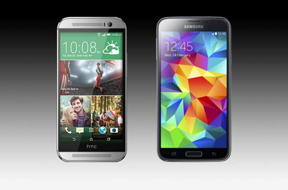
Last week, I had the opportunity to have hands-on experiences with many new phones. Two of these phones were the Samsung Galaxy S5 and the HTC One M8.
I will focus mainly on the UI of both of these devices, which means this is pretty much a newer TouchWiz Vs. Sense article. Don’t worry though, I’ll make it worth your time.
First of all let’s go through this systematically.
Fluidity
To be honest, both devices are what I expected from respective flagship devices.
The first thing you notice on the S5 is that TouchWiz feels a lot lighter. Almost as if they have lightened (not the bloatware) the size of it. I understand there are more stock apps such as S Health and S Remote (I think that’s what it is called) and whatnot, but it actually feels a lot easier to manouvre around in terms of fluidity. One thing leads to the next and the animations are neat, albeit unneccessary.
The M8 also impressed me here. I didn’t see a massive jump in terms of fluidity from it’s predecessor, not to say it hasn’t improved… it has, but just not by a massive amount in my opinion. It felt the same as if I was using the previous version.
Winner: By a small margin, the S5
Appearance
The S5‘s UI is pretty bold and out there. Personally, I did not like it at all. I almost regurgitated by looking at the icons and magnified items. they have tried the “less is more” option here, but I think they failed in this department. The settings looks so bad. YouTube ’em. Terrible.
The M8 impressed me a lot this year. Sense 6.0 (I think) has surpassed my expectations, they have lessened the stiffness that had become of sense and allowed for change. I particularly like the look of the menus, the character sizing on default and everything about it just looks so darn appealing. Props to you, HTC. Props to you.
Winner: By a mile, the M8
Animations
Both devices are filled with animations but I didn’t get too much time analysing these.
Winner: I’ll call it a tie.
Camera
The S5 has a nice, cleaner look to it but nothing majorly different. Same goes for the M8.
Winner: I’ll say the M8, just for the heck of it.
OVERALL WINNER FOR USER INTERFACE:
HTC ONE M8
Bravo HTC, or rather, shame on you Samsung, for creating such a pathetic UI in the form of the new TouchWiz. Instead of Sense winning. Think of it like TouchWiz losing.
Peace,
Syd

